Much has been written the last few years about the struggles of Michigan’s football team. The search for the reasons behind these struggles has created something of a cottage industry amongst us fans. Lloyd Carr left the cupboard bare when he retired because he failed to recruit well. The spread won’t work in the Big Ten. Youth. Angry Michigan Secondary Hating God. Lack of family values. Players being R-U-N-N-O-F-T by harsh language and harsher physical training. GERG. The list is long and each potential reason probably tells you more about its advocate then about why Michigan is having such a hard time transitioning from the Lloyd Carr pro-style era to the Rich Rodriguez spread ‘n’ shred era.
The answer, however, is right before our eyes. It’s the uniforms, stupid. Yes, the uniforms. Look at these things, no stripes, no wings—except on the helmets and what good does that do?--no diamond plating, no snazzy logos, no aggressive or fearsome animal faces with sharp pointy teeth (in spite of the fact that the wolverine is one of the most aggressive and fearsomest animals around). It’s just plain, plain, plain maize and blue. Ho hum. Zzzzzzzzzzzzzzzzzzzzzzzzzzzz (that’s people falling asleep because it’s so boring and bland).
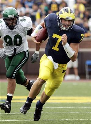
Now look at this:
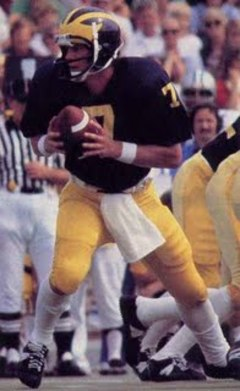
Guess what boys and girls, that’s not the same guy. Not that you would ever know it, but those two number 7’s played 29 years apart. That’s nearly three decades with no uniform change at all. Except for the socks; because that’s how we rolled back in the 1970’s, with tube socks that reached our knees.
So, aside from this small concession to fashion, Michigan’s been wearing the same style of uniform since, what? ‘Nam? Prohibition? The Great War? Yes. Yes. And yes.
Hell, Michigan might as well be wearing something like this with pants intended to look like canvas/sailcloth and a faux leather helmet. You want tradition, that’s tradition.
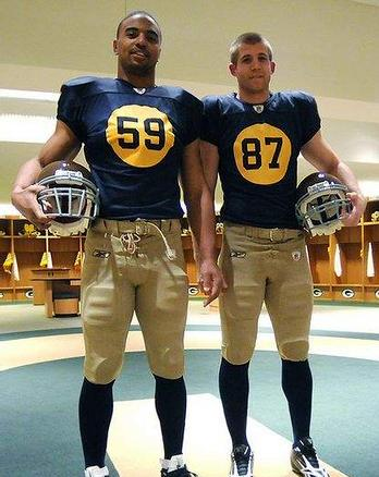
Even when digitally rendered it looks old. And slow. And that right there is the point; the uniforms look old and slow and therefore they just do not attract the right kind of athletes—young and fast, really fast—to execute Rich Rodriguez’s speed based spread ‘n’ shred.
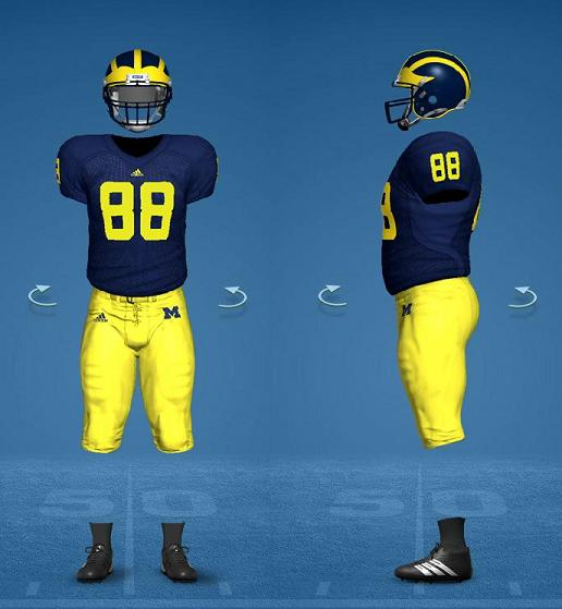
So, who gets kids with speed to spare? Who runs an offense so fast opponents have to fake injuries to slow it down? Who naps through the first half of most of their games and then pours it on in the second half explosion of points because they are so mind-numbingly fast they only need a half to blow you out? Who is the top ranked football team in the country?
You guessed it, these guys:
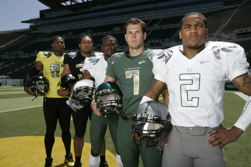
And just get a load of those uniforms and the colors that have nothing to do with the University of Oregon and the infinite number of possible combinations (I’ll have a white helmet, a yellow jersey, and some grey pants, please). They have wings, too. Only they’re attached to the shoulder the way useful wings should be. And apparently, Oregon is really fast because of it. Before they had wings they had these:
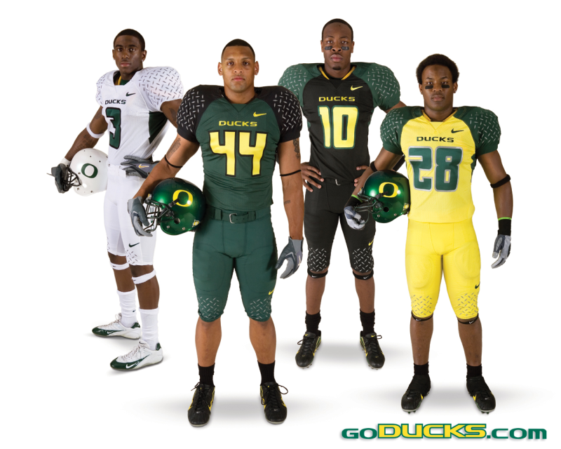
Because pick- up trucks with big chrome plated toolboxes are also pretty fast once you get them out on the highway. But since ducks can’t really drive as well as they fly—it’s a webbed foot thing that they’re a little self conscious about so try not to stare—the Oregon teams with the wings are faster than the old diamond plate version. But that old version was still pretty fast.
College football fans have been complaining about Oregon’s ugly uniforms since Nike started our long national nightmare of outfitting college football teams in uniforms designed by the mentally ill. No one likes them and yet elite—and really fast athletes—keep answering “yes” to the question: “Are you willing to run around in fluorescent yellow spandex?” Apparently, we college football fans are too old and slow to get it.
Still not convinced that it takes ridiculously garish uniforms to attract really fast athletes? Behold:
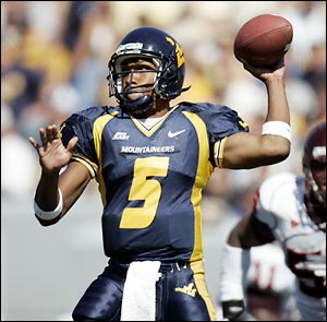
Yep, that’s Pat White as in the guy we keep hoping Rich Rodriguez finds the next one of. Notice the “fast” font and crazy stripes that run from his neck to his calves. This outfit has “speed” written all over it.
Take a look at this thing. Yes, it hurts your eyes and looking at it for too long will give you a migraine but I think that guy is about to break the sound barrier.
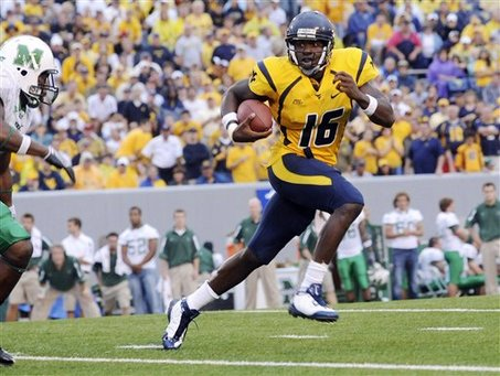
Here we have Pat White again blazing past some opponents in even uglier—yet not as fast looking—uniforms. Oregon has yellow uniforms; West--By God--Virginia has yellow uniforms; it doesn’t take an engineering degree from the University of Michigan to figure out what is going on here.
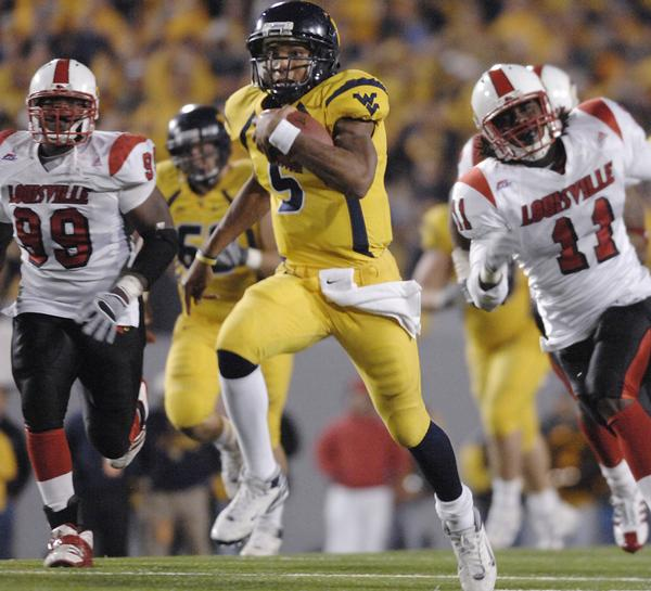
It should be obvious that if Rich Rodriguez is going to have the same sort of success he experienced at West Virginia, Michigan will have to get with the times and adopt some fast uniforms to attract some more fast recruits—who, hopefully are academically eligible and stick around—to play the speed based style of football Rich Rodriguez employs.
I therefore present the new, improved, RichRod, Spread ‘n’ Shred Pro-Combat uniform system:
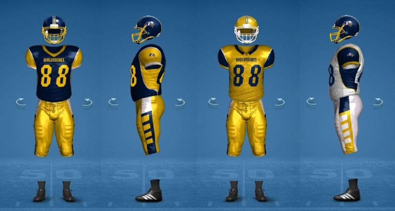
You’re welcome.
Think about, we may already have the next Pat White in Denard Robinson. He is already breathtakingly fast while wearing Michigan’s tradition-bound, plod and slog uniforms. Just think how fast he’ll be in this getup. Oh, and the alternate all “maize” ensemble—remember Oregon and West Virginia, people—will go great with a “Maize Out” in the Big House.

But wait, there is more. Here’s the new aggressive and fearsome—and fast—Michigan Wolverine logo. I asked and the internet--via Google--delivered. Notice the rage and the pointy teeth and the swooping arc like it’s pouncing on its prey really fast. Additionally, the whooshing lines on the right look kind of like sharp claws which are almost as scary as sharp teeth. The best part--the part that makes adopting this logo pure genius--is that those lines also resemble the dreadlocks of one Denard Robinson as he zips past pretty much everyone. Maybe Michigan won’t need another Pat White but instead will keep needing another Denard Robinson.
So, there you go, new uniforms, ridiculous color and striping schemes and a logo that will give toddlers nightmares; all the things that are really required to employ a speed based style of football and lift Michigan football up to the next level. After all, Ohio State didn't wear their boring traditional uniform this Saturday and I can scarcely remember the last time they lost to Michigan (maybe they need their Pro Combat gear for games against SEC opponents?).
Again, you’re welcome.
No comments:
Post a Comment